Tuesday, October 25, 2016

Convey Your Business’ Market Position with Your Vehicles

When you arrive at your customer’s residence and expect to be welcomed and trusted to be let onto their property, you better believe they are looking closely at your vehicle. So use it to claim your market position.

If your business is named Budget Plumbing, a few simple decals with your logo, phone number and web address are appropriate and what bargain-hunters want to see and will choose. On the other end of the scale, if you’re a high-end bathroom remodeler, for example, you can show two key visuals that tell a before and after story and still have room to list the high-end neighborhoods you serve (or want to!). 

If you’re in real estate, you can convey the type of listings you want with the impression your vehicle gives off:  a Mini Cooper with cheery decals conveys fun and modern but frugal; a fully wrapped Lexus with metallic accents projects high-end and successful. 


It’s Your Reputation and Your Vendors
Your wrap graphic designer/printer/installer should understand that your reputation is riding on the quality and visual interest your wrap conveys. If you’re a memory care facility, a calm palette with basic information may be appropriate. If you’re a hard rock radio station, well, the sky’s the limit.

At the same time, your vendors’ reputation is out there every day too. Is the install done perfectly? Do all the colors match exactly from truck to truck? What about maintenance? How will wraps affect the paint or not? What about removing the wrap because the company logo changed or they want to up their market position?

You can use your vehicle wrap to differentiate your brand from competitors by showing something unexpected or memorable such as a clever tagline or a one-line quote from a satisfied customer. By doing that thoughtfully, you can reinforce your brand and market position so what your customers think of you and what you want them to think become more closely aligned.


SpeedPro Imaging of Denver has worked with a fleet of one and fleets of 600. We’ve got your vehicles covered, you focus on your customers. Reach us at 303.426.4199, denver@denverspeedpro.com, www.denverfleetgraphics.com or www.speedprodenver.net

Monday, September 26, 2016

Retailers, We’ve Got Your Signage Covered: Inside, Outside, Offsite and On the Move

Let’s take a walk in your prospects shoes to “see” what they see:

We walk into a new store. The storefront images were eye-catching and we see an engaging graphic on the ground. We are intrigued enough to open the door with the business’ logo on it. There is a second entry with another transparent panel. There, we notice a frosted version of the logo prominently displayed.

After entry, signage behind the check-out and at counter-level is keeping us engaged, visually directing us and encouraging us to purchase.

As we move through the store, we see the logo boldly placed on glass jars and baggie labels for smaller items. We notice that even items like lighters and free samples are branded!

 We make our purchase and notice the clerk is tucking our items into a bag with a logo’d decal. Then, a custom “Thank You for Shopping at Acme” sign is the last impression as we walk out the door.

Now let’s go behind the scenes as the owner or store manager:


Off the retail floor, you may need signage in the form of high tack adhesive labels for inventory management, and poster-sized informational signs with employee rules. We also find fun, motivating messages about the stores’ culture.


Heading outside, there are many more branding opportunities:

If you’ve noticed colorful vehicles strategically parked but don’t yet have fully wrapped mobile advertising or even simple door decals, you are missing out on an inexpensive but highly effective opportunity. And, if you own the building or can lease any outdoor surfaces, visualize wall murals you have seen from down the street and see your own brand there!

Are fairs and festivals part of your marketing mix? Do you host parking lot events? Your logo’d tents with fluttering flags and tables with customized throws, skirts and runners are sure to enhance your visibility with a welcoming look that drives traffic.

SpeedPro Imaging of Denver can design, print and install every item listed in this blog for your shop. Reach us at 303.426.4199, denver@denverspeedpro.com or www.speedprodenver.net

Monday, September 12, 2016

Question: How to Confidently Manage Your Event Planning Long-Distance?

Answer: Hire a local company that’s been there and done that countless times!

You’re an event planner and you love it. As the conductor waving your wand over suppliers, you thrive on the pressure of managing your event that’s going to take place in Denver from your East Coast location. So on the checklist with all your large format printing needs listed, choose a locally based, proven printer, and keep your focus on putting bodies in the seats.

In the early stages of your event planning, taking a virtual walk-through of any venue without flying out is a great option to increase your comfort level. Plan and address those details of the visual path your attendees will take using a variety of apps like Google Duo, Tango and ooVoo Video Call. These walk-throughs from your out-of-state location are a breeze with a local printer! And, a local printer will know the venues rule and regs for hanging signs, options for wayfinding signs, podium signage, oversized agendas, oversized speaker promo boards and trade show booths. 
Hiring local also gives you the benefit their familiarity with the in’s and out’s of delivering to all the big venues and hotels around the metro area. For example, at the Colorado Convention Center, deliveries for trade show booths without being an attendee must go to a specific security gate to ensure the delivery gets to the booth in very short order. Conversely, at The Denver Mart, print vendors can hand-carry deliveries right to your meeting room or booth.

Choose SpeedPro Imaging of Denver and you’ll experience the same high-level of service as our two clients’ quoted on this blog!  Reach us at 303.426.4199, denver@denverspeedpro.com or www.speedprodenver.net

Tuesday, August 16, 2016

Consider the workhorse banner.

You see them everywhere in your personal life from your local watering hole promoting happy hour specials, strewn across downtown streets announcing a Bronco’s playoff win, at fairs and festivals year-round, and when you’re crossing a finish line or watching someone else cross one.

The common banner is still an affordable and valuable attention-getting tool because its size with an interesting message and visuals can tell a quick story:  “Stop here for cheap booze!” “Don’t miss us, we’re amazing!” “Join the celebration now!” For business-to-consumer audiences, banners can be basic because the shelf life may be relatively short but they will look professional and are generally effective.

In your professional life, for business-to-business uses, banners can be designed with more longevity in mind. So, for example, when your marketing plan has your company exhibiting at three major industry trade shows a year, it’s worth considering the banner placement options:

·         Where is your booth location -- corner versus mid-row?
·         What size is the booth and many staffers will be working it at one time?
·         Will the banners be hand-carried or shipped directly to the booth?
·         Can banners be placed to be viewed from both sides?
·         Will there be room for floor banner stands and a back wall banner or would floor banners that extend to seven feet both provide impact and be chosen for the ease of handling?


Consider the shipping and handling of a six or seven foot back wall banner versus stand-alone banners designed with attention-getting messages at the top. Then, consider vertical banners that can be designed to retract cleanly—eliminating those worries about creasing your investment when packing up; just retract and go with the two or three foot case. There are even tabletop retractable banners that can extend to 24” 32” or 40” high—perfect for a smaller booth!


Great. Big. Graphics. It’s what we do. Contact SpeedPro Imaging of Denver to learn about the wide range of banner options available, tell us your situation, and we’ll suggest the best banner for your setting. 303.426.4199. www.speedprodenver.net denver@speedprodenver.com

Monday, August 1, 2016

How to Get Your Staff Excited About Working Trade Shows

Present the most eye-catching, stop-in-your-tracks booth graphics!

Before the doors open and all those wonderful potential customers flood into the event hall, a lot of the hard work is done. The planning, “should we invest in a full booth or create a booth-in-box?” and most importantly what to “say” with booth graphics will be decided along with considerations such as should an event within the event be sponsored? Who will work the booth? Who will handle the set up and tear down?

Trade shows are hard work but with the right messages presented in an interesting way, you can have booth graphics that stop prospects in their tracks or at least slow them down. Then, booth staff can feel more comfortable approaching prospects who have already engaged with your business even at a minimal level and they’re more likely to listen to the 15-20 second pitch your staffer has on the tip of their tongue.

Let’s say you are a company that is going to do numerous regional shows. A booth-in-box; a back wall banner, a table skirt and throw with a couple of pop-up banners may offer enough flexibility in booth size and placement to be an affordable, luggable option for a start-up. If you are more established, it might be time to invest in bigger, more complex booth properties. 

Choose Your Vendor from Design through Delivery

Since your booth properties are an investment, it will be worth-while to spend some time choosing your printer/producer. Longer-term relationships such as these are valuable and will save you time and ultimately money. You want a vendor that understands the context the properties will show in and that they are producing investment properties that will be used over and over. So not only do they have to be visually a stand-out, they need to pack and travel well too.

Plan and produce every over-sized print piece together. For example, if you’re sponsoring a happy hour, you’ve purchased a signage opportunity so a simple but interesting banner with your logo on it, of course, with a drinks on us sentiment hanging overhead can make enough of a statement. Having one printer produce all the items for an event will ensure continuity in the look and feel of the pieces--not to mention perfect color matches.

Make your staff feel proud and excited to represent your company confidently by choosing well-designed, colorful, show properties and it will pay off in goodwill and in leads!


Great. Big. Graphics. It’s what we do. 

Contact SpeedPro Imaging of Denver for a quote on your new trade show properties. 
We’ve delivered to all the big venues and hotels in the metro Denver area for years. 


Monday, July 11, 2016

Florence Nightingale Was Right

Sometime before the turn of the last century, “The Lady with the Lamp” advocated the use of natural sunlight and soothing colors to create a relaxing setting that would encourage healing. Research has confirmed that Florence Nightingale was right1. Patients in well-designed hospital rooms experience less anxiety, require less pain medication and have shorter hospital stays, according to The Center for Health Design, an organization of health care and design professionals that uses evidence-based research to develop standards for functional hospital designs.

Hospitals have always employed architects, of course, but didn’t necessarily heed Florence’s advice. That has been changing and in a big way. “Positive distractions,” such as beautiful artwork, give patients something to focus on, other than their discomfort from medical procedures.2 Sky Ridge Medical Center in south Denver ranked an impressive 7 out of 25 in The 25 Most Amazing Modern Hospitals in the World published in April, 2015 by the Best Master of Science in Nursing Degrees organization. The ranking came in no small part to its extensive art collection with pieces selected specifically “to bring aesthetic beauty and a sense of home to guests.” Note they don’t have patients, they have guests!

Still, we tend to visualize hospitals as well as urgent care facilities and out-patient treatment centers as bright white boxes that we’d rather not go to. So maybe we just haven’t noticed the shift going on because it can be as subtle as a soft yellow paint instead of a jolting white, wall murals depicting outdoor scenes in a waiting room, or elevator wraps with cheerful seasonal messages.

Most healthcare providers know they realistically can’t obtain a pricy art collection to raise the aesthetic beauty of their facility, but may not know where to start to bring in some color. SpeedPro Imaging, a large format print studio, has worked on-site at hospitals to develop those “positive distractions” for their waiting and patient rooms, as well welcoming outdoor banners and wraps for elevators. Creating interesting graphics is what we do.


Sources:
1 International Network for Neuroaesthetics, Published July 17, 2012 Written by Meika Jensen

2 Positive Distractions, published March 11, 2012 by Debajyoti Pati, PhD, for HKS Clinical Solutions & Research in collaboration with American Art Resources designed a study to examine the influence of positive distractions in the dental and cardiac clinic waiting areas at Children's Medical Center of Dallas. A positive distraction has been defined as “an environmental feature that elicits positive feelings and holds attention without taxing or stressing the individual, thereby blocking worrisome thoughts.” 

Thursday, June 30, 2016

It’s a Wrap!

No, not a burrito, a Greek gyro or the end of filming a future hit movie. . . It’s your vehicle that will be a hit if you wrap it up.


Why Wrap?

Wraps are affordable and anytime you are out on a job, your prospects can “see” you at work or roaming around their neighborhood or territory. For already-distracted drivers whizzing by a billboard, a wrapped truck will be more memorable.


Build brand awareness by displaying your logo as unique moving billboards. It makes sense and will make you lots of cents! Here are more benefits to choosing vehicle wraps:
  • You can show off examples of your work right on your vehicle
  • You can easily and affordably have wraps and decals changed out
  • Wraps also serve to protect the paint/finish of your vehicle--much like a clear-bra
  • A website URL and phone number may be the top two visual priorities but that still leaves plenty of room to get creative and colorful (We typically recommend sparse copy. Too much information gets forgotten.)

Vehicle graphics are commonly regarded as one of the most effective forms of advertising with costs as low as 5 cents per thousand impressions


Rocky Mountain Custom Landscapes (RMCL) came to SpeedPro and requested a colorful wrap design and one that showcased their work. With a large box truck as a blank canvas, SpeedPro designers had a ball creating a unique and interesting wrap for an 18’ by 7’ box trailer. Our client was so happy with our work, here’s what he had to say:

“SpeedPro wrapped our entire fleet of trucks, box trucks and trailers and did it fast and affordably. Hands-down their graphic design services has made them our go-to vendor. We starting working with them several years ago after talking with other companies and have been consistently happy with their services.” – Jason Ulberg, Vice President/Owner, RMCL


SpeedPro has designed, produced and installed hundreds of wraps and decals on anything that moves (or doesn’t, we’ve wrapped mailboxes) including cars, trucks, trailers, food trucks, golf carts, boats and Zamobi’s. We’d love to provide you with a quote for your fleet of one or 1,000!

SpeedPro Imaging of Denver
303.426.4199


Monday, June 13, 2016

Ad Agencies and Their Print Vendors

A Close, Crucial Relationship

Did you inherit your print vendor when you changed agencies? Happens frequently in our new normal climate of job-hopping. If your new employer has already vetted them, it should be worth it to give them a chance before suggesting switching. Because an established relationship usually puts your business at the top of the priority list.

Your printer should know and appreciate that they are not only representing your agency but your customers’ too, and value the opportunity to visually represent both.

At a minimum, the printer should have an excellent on-time delivery record at competitive prices. Some print studios offer creative services you can tap into either in a crunch, a transition, or just because you want to try out a new designer.


Does your printer have a back-up printer so they never let you down? You love fast food and clothing chains, choosing a franchise printer like SpeedPro Imaging of Denver gives you the benefit of having built-in back-up, consistent and committed, without you having to scramble or even be aware of the crunch; that’s for your printing partner to work out, not you!
SpeedPro Imaging of Denver knows that agencies are always in fast mode to please their clients. Jobs we have handled for B2B and B2C agencies include but is by no means limited to banners, board prints, banner stands, door decals, elevator wraps, feather and tear-drop banners, hanging posters, vehicle decals, point-of-purchase graphics, and yard signs.

At the end of the day, we know it is about your getting print jobs completed, when you need them and flawlessly. We do that every single day for our clients.

“Jobs from SpeedPro always turn out great. Their prices are competitive and it’s not unusual to get early delivery. I manage a lot of print buys for my agency so I appreciate that my over-sized jobs will be handled not only quickly but at the high quality level I’m expecting.Alexandra Moyers, Project Manager, Brand Iron, Denver, Colorado

Tuesday, May 31, 2016

When is it a good idea to hug a window?

When you’re a window cling!

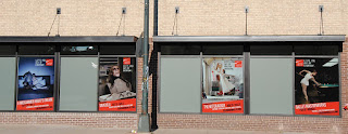
Window clings and high tech, not two things we typically associate with each other but consider this:  the newest window clings are not only eye-catching but are great for any business with foot traffic. When you hear the word “cling” you might picture a small round black and white sticker or uneven black lettering, but forget about those basic window stencils. Using the latest in printing advancements you can now have window clings that are colorful, creative and bold.

Here at SpeedPro Imaging of Denver, we use a new, reusable window film called Glass Adhere. This product uses a technology different than traditional “static” clings. It has micro-suction cups on one side, and can be used over and over--allowing you to rotate images regularly. If it ever becomes dirty, simply wash off it off and reapply.

By using window graphics as your primary signage you give yourself the flexibility to quickly, easily and affordably change out your brand image at will. Think of Glass Adhere as a billboard and use big bold images with sparse on-point supporting text--and that’s all. Here are just a few examples of how mighty but flexible window graphics can be used:

·         as branded signage
·         with seasonal imagery and messages
·         to announce a sale
·         to announce closeouts
·         to announce specials
·         to convey any message any time you want

Still not sold? Glass Adhere graphics stick to glass without adhesive, can be moved around after placed if desired, can be mounted inside or outside glass, and, are easily removed.

At SpeedPro Imaging of Denver, we custom design all types of temporary and permanent window graphics in any shape you want to give you eye-catching and totally unique designs (you can hug us later :-).

Tuesday, May 17, 2016

Imagine hundreds of competitive runners pounding over your work


Will it hold up? Ours did!

No boring highway race for our Mile High city! The 2016 Colfax Marathon route went through a fire station, through the Bronco’s Mile High Stadium where runners appeared on the JumboTron–early in the race and then again near the end–and along Sloan’s Lake, as well as through lots of interesting neighborhoods on the 26.2 mile route. The racers eventually wound their way back into beautiful City Park. Exhausted but exhilarated, racers ended their perfect running weather day with BBQ and beer. Lots of BBQ. Lots of beer.

But, before any runners showed up for their 6 a.m. start time, in the wee hours of the morning on May 15, the SpeedPro Imaging of Denver team arrived well ahead of the more than thousand race competitors. In just a few hours in their very own marathon, they put down great big colorful graphic markers for each of the 26 miles for the full marathon and another 13 for the half-marathon in just a few hours.
“Most of the runners probably whizzed by too quickly to appreciate the detail and care that went into producing and installing these custom graphics, but I know our studio, once again, delivered great work for this big event,” said Darin Schneider, SpeedPro Imaging of Denver owner and general manager.

Removing the graphics even faster than they were put down at the end of the day is not the fun part of handling jobs like this, but it is satisfying to be trusted to handle the job from start to City Park finish line!